Friday, February 7, 2020

Tuesday, February 4, 2020

Shoot Plan for Audio Visual

Location: Studio set up in Media classroom- Blue Screen

Time of Shoot: Wednesday P3 11.05- 12.05

Camera Set Up: 3 cameras - one central- shot of everyone, on left- 2 people on the left and one right- 2 people on the right.

Shooting plan:
For each topic of conversation I will breif the cast and give them the research to use in the conversation. I will roll for roughly 5 minutes so the conversation feels natural then cut and brief them for the next topic of conversation and repeat the process. 

Topics of conversation:
TV / Film
Music
World News

Cast:
Tarran
Josh
Megan

Editing:
I will cut the highlights into a 2 minute montage as a teaser for the actual talk show which will be a call to action for the YouTube page. 

Sunday, February 2, 2020

Audience Research for Audio Visual Results

Overall I had 40 responses. For my first question, the results show that they want TV /film to be spoken about the most, followed by music and then world news so I will use this to help me create a supporting prompt sheet for my participants. 10 of the 40 people suggested other and specified what they want the topic of conversation to be about- 4 of the responses was sport, 3 of them were comedy, 1 was video games, 1 was science and the final 1 was controversy.

The second question clearly stated that my TA wants a casual conversation mostly because it would be more comedic and relatable. Many also said it's something they would watch / listen to while doing something else and that a casual conversation is easier to switch between actively and passively watching /listening 
Finally, the last question informed me that the opinion of the participant is very important to my TA and that it would be better if it was based off of some facts and research. So before I film I will do some research on the topics for my participant to get prompts from. 

Thursday, January 30, 2020

Audience Research for Audio Visual

To find out what my TA would like to be discussed during the talk show I have created another survey. It asks 3 questions:

1.On a talk show/ podcast, what would you like the topics of conversation to be about? (Pick 1 to 3 answers)
- Music
-TV/Film
-Celeb Gossip
-Politics
-World News
-Other (specify)

2. When watching a chat show would you prefer them to speak formally or casually? Why?


3. What would you prefer the conversation to be based on? 
-Their opinion
-Research
-Their opinion based on research

I chose these questions as it allows me to gather what my TA wants and how I should set it out. It also tells me how is should prepare the cast and what I need to brief with them.

Monday, January 27, 2020

Talk Show Podcast Research

The Secrets Out- Alfie Deyes

Similar to an interview but more attractive to my TA is a podcast.


The Secrets Out is a podcast style talk show where Alfie, the host, invites people to talk about the secrets people have sent in anonymously. They each take a turn in reading out the cards for everyone to talk about. This series has the same TA, 16 to 25, and is interesting to watch. I'd like to create something similar for my magazine.

The episode opens with a short montage of clips where they are discussing something funny or something important and that lasts for roughly 40 seconds. There are a range of shots from 3 angles -one showing all (snippet above) and the other two showing the two participants on each side of the table.


The shots alternate depending on who is speaking and who is reacting. There would have been 3 cameras set up to create these shots and therefore the editing is a very important step here. The cameras also pan very slowly in some shots to create a less static, more flowing feel.


There is also an animation title slide just after the montage which signifies the beginning of the episode which I think is effective.

I think this would be a great AV element for my magazine as it suits my TA and could be a great series. Rather than speaking about secrets I would have the subscribers send in topics of conversation, what they want to hear discussed. This episode is 50 minutes and 25 seconds long which is much longer than I am going to do so a teaser trailer would be a great call to action to a separate social media- YouTube.

Sunday, January 26, 2020

Audio Visual Plan

Plan:

Genre: Talk Show/ Podcast Teaser Trailer

Set:
Studio, seating together
Conversation cards sent from magazine subs
Glasses of water

Topics on conversation cards: *ask about what people want to hear*
-Music
-Film/TV
-Fashion
-Celeb Gossip
-Politics
-World News

Participants:
4 people - 2 male 2 female preferably

Thursday, October 3, 2019

Audio Visual Research

Comparing Two Audio Visual Elements from Two Magazine Websites
ELLE Magazine

Genre: BTS Montage

 Opens with presented by Hearst. There is no sound until the action begins. I shall ad this as my distributor is Hearst.
There is next the sponsors name. I don't have a sponsor. Here I will put the name of my magazine
 First shot is an extreme close up of a watch- one of their products and the music is introduced. Throughout the shot film there is use of foley- focusing on the shoes and the sound of the skateboard. The colour pallet is pretty muted but bright. There are many settings- the bathroom, a corridor, the stairs, a street and a studio. Most of the shots were very short and snappy, there were no shots longer than 3-4 seconds long. . There were also a large variety of shots and it was in slow motion but only slowed down a minor bit. As she makes it to the studio and is being made up for a photoshoot the music gets more chaotic and fast to reflect the pace of the action which I liked. The very last shot was of the final product of what was done that day as a still image.

The video was naturalistic in an idealistic way. It presented things that can be done in everyday life but in what almost feels like you're looking through a filter in the sense it looks minimalist, uncluttered and celebrity lifestyle-esk. It would definitely fit my 16 to 25 years TA
ELLE Magazine Audio Visual Example

BAZAAR


Genre: Interview
Opens straight into a cut away of Lily in a photoshoot. There is a quiet, simple track paying in the background from the beginning. There is a short montage of the shoot before the next image.
 Before each subject there is a title over a cut away from the photoshoot.
 The music still plays quietly while she speaks.
In comparison to ELLEs short film this one doesn't have many different shot types as it mainly focuses on her being interviewed.

The colours here are also muted but much further, almost black and white which I don't think would meet my TA very well.
At the end it has a "Like, follow, share" slide which i think would world well with my TA as social media is a huge part of their daily life.

BAZARR Audio Visual Example

Wednesday, October 2, 2019

Making My Logo

Logo Designs:


1.                                                                                      2.


Overall, I prefer the second one, I feel it looks best on my website. I asked people who fit the TA and they also prefer the second one as it is more interesting and eye catching.

*** After trying the logos on my website, I feel my original choice was to busy and dark for my website and overall didn't fit very well so I changed to the other more simple one***

Wednesday, September 25, 2019

Website Layout Research

I need to design a website that relates well to my magazine, to do this I need to follow conventions and look closely at other entertainment- fashion lifestyle magazines. Here is what I found in order of how I saw it.

Look Magazine:

A Pop Up- personally I find pop ups quite annoying, the screen loads first and just as you're about to get on with what you can to the website for it pops up and and demands you do something which you have to do so that you continue doing what you first intended to do. For a privacy, competition, discount code notifications I prefer a banner at the top or bottom of the page, its less demanding and more user friendly.


The Masthead- It is certainly necessary to have the masthead the first thing a user sees, it lets them know they have found the right website and it is the biggest link to the physical magazine and creates synergy.


An Ad- This product would be well advertised to the TA of LOOK. It is a very female based aged 25-40 TA at which age hair dye would be of interest to them. If I am to use an advert the product must be of intrigue to fun loving go-getters aged 16 to 25 of both male and female.


The Navigation Bar- The navigation bar was right under the masthead and is very user friendly. They are a solid convention of websites in general, not just magazine websites which is why I will definitely will be using on on my website.

The navigation bar also has subheadings for 'Life' and 'Hey Busy Girl' which I like and think would be helpful for users.


Social Media Links- This is very important when it comes to attracting my TA. My research on my target audience revealed that 80% of respondents 'hardly ever' read magazines; which is the result of having everything in the magazine available on their phones, tablets, laptops etc. Having social media links would be a great way to advertise something exclusive to the magazine.

A Large Image/Title- As you scroll down you see a very large image. I found that this image was too big, you couldn't see the whole image without having to scroll up and down and the white text was difficult to read with the background. However, I like the idea of having an image as a title background. This highlights to me that I'd have to be careful in choosing the image and text colour. Furthermore, if you click on the image it takes you to a feature page that links to the title on the image.

The Features- As you scroll down, you reach a heading and the features that relate to the features. I like this, its very organised and clear. This would be a great opportunity to link to the magazine, maybe there is an feature in the magazine that requires updates, this would be a good call to action and persuade readers to visit the website.

Page Link- At the end of each section of features it give you the option to view more feature which is I like.


Elle Magazine

Thing that Elle has the Look doesn't:

Navigation tool


Next to the navigation bar, there was this symbol, when you click on it takes you to another navigation tool.


5 Suggested Features


Picture links to the top 5 features are right under the navigation tool.


Rather than being under a heading each feature has a tag to say what section they are from.


Variety Magazine:

Some things different Variety has:

Top Story Section- similar to Elle but presented differently.


A Login- Create an account. This could be great at personalising a users website experience with recommended section due to past articles read etc.w


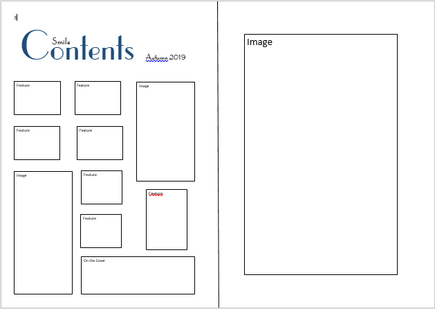
Contents Plan: Edition 2


Contents Plan: Edition 1


Monday, September 23, 2019

Contents Research

To help work out my contents page layout I'm researching pre-existing contents pages ones to see how I can create one of my own.


I was originally thinking of doing a single page contents however, I like the idea of a full page image on the right like the content age from ELLE, it looks sleek and clear which I really like and it will appeal to the TA. I also like having a heading to each section of the contents like in ELLE and GLAMOUR. All the contents pages uses columns to present their feature which is definitely something I'm going to use, columns are a connvetion of magazines across all genres so I think its very important to use them.