
Thursday, September 26, 2019
Wednesday, September 25, 2019
Website Layout Research
I need to design a website that relates well to my magazine, to do this I need to follow conventions and look closely at other entertainment- fashion lifestyle magazines. Here is what I found in order of how I saw it.
Look Magazine:
 A Pop Up- personally I find pop ups quite annoying, the screen loads first and just as you're about to get on with what you can to the website for it pops up and and demands you do something which you have to do so that you continue doing what you first intended to do. For a privacy, competition, discount code notifications I prefer a banner at the top or bottom of the page, its less demanding and more user friendly.
 The Masthead- It is certainly necessary to have the masthead the first thing a user sees, it lets them know they have found the right website and it is the biggest link to the physical magazine and creates synergy.
 An Ad- This product would be well advertised to the TA of LOOK. It is a very female based aged 25-40 TA at which age hair dye would be of interest to them. If I am to use an advert the product must be of intrigue to fun loving go-getters aged 16 to 25 of both male and female.

The Navigation Bar- The navigation bar was right under the masthead and is very user friendly. They are a solid convention of websites in general, not just magazine websites which is why I will definitely will be using on on my website.
 The navigation bar also has subheadings for 'Life' and 'Hey Busy Girl' which I like and think would be helpful for users.

Social Media Links- This is very important when it comes to attracting my TA. My research on my target audience revealed that 80% of respondents 'hardly ever' read magazines; which is the result of having everything in the magazine available on their phones, tablets, laptops etc. Having social media links would be a great way to advertise something exclusive to the magazine.
 A Large Image/Title- As you scroll down you see a very large image. I found that this image was too big, you couldn't see the whole image without having to scroll up and down and the white text was difficult to read with the background. However, I like the idea of having an image as a title background. This highlights to me that I'd have to be careful in choosing the image and text colour. Furthermore, if you click on the image it takes you to a feature page that links to the title on the image.

 The Features- As you scroll down, you reach a heading and the features that relate to the features. I like this, its very organised and clear. This would be a great opportunity to link to the magazine, maybe there is an feature in the magazine that requires updates, this would be a good call to action and persuade readers to visit the website.
Page Link- At the end of each section of features it give you the option to view more feature which is I like.
Elle Magazine
Thing that Elle has the Look doesn't:
Navigation tool


Next to the navigation bar, there was this symbol, when you click on it takes you to another navigation tool.
5 Suggested Features

Picture links to the top 5 features are right under the navigation tool.

Rather than being under a heading each feature has a tag to say what section they are from.
Variety Magazine:
Some things different Variety has:
Top Story Section- similar to Elle but presented differently.


A Login- Create an account. This could be great at personalising a users website experience with recommended section due to past articles read etc.w
Look Magazine:
 A Pop Up- personally I find pop ups quite annoying, the screen loads first and just as you're about to get on with what you can to the website for it pops up and and demands you do something which you have to do so that you continue doing what you first intended to do. For a privacy, competition, discount code notifications I prefer a banner at the top or bottom of the page, its less demanding and more user friendly.
 The Masthead- It is certainly necessary to have the masthead the first thing a user sees, it lets them know they have found the right website and it is the biggest link to the physical magazine and creates synergy.
The Navigation Bar- The navigation bar was right under the masthead and is very user friendly. They are a solid convention of websites in general, not just magazine websites which is why I will definitely will be using on on my website.


Social Media Links- This is very important when it comes to attracting my TA. My research on my target audience revealed that 80% of respondents 'hardly ever' read magazines; which is the result of having everything in the magazine available on their phones, tablets, laptops etc. Having social media links would be a great way to advertise something exclusive to the magazine.

 The Features- As you scroll down, you reach a heading and the features that relate to the features. I like this, its very organised and clear. This would be a great opportunity to link to the magazine, maybe there is an feature in the magazine that requires updates, this would be a good call to action and persuade readers to visit the website.
Page Link- At the end of each section of features it give you the option to view more feature which is I like.
Elle Magazine
Thing that Elle has the Look doesn't:
Navigation tool

Next to the navigation bar, there was this symbol, when you click on it takes you to another navigation tool.
5 Suggested Features

Picture links to the top 5 features are right under the navigation tool.
Rather than being under a heading each feature has a tag to say what section they are from.
Variety Magazine:
Some things different Variety has:
Top Story Section- similar to Elle but presented differently.

A Login- Create an account. This could be great at personalising a users website experience with recommended section due to past articles read etc.w

Monday, September 23, 2019
Contents Research
To help work out my contents page layout I'm researching pre-existing contents pages ones to see how I can create one of my own.


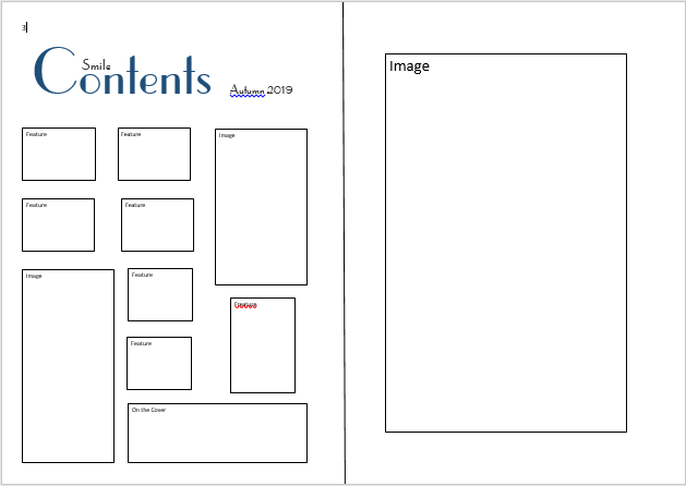
I was originally thinking of doing a single page contents however, I like the idea of a full page image on the right like the content age from ELLE, it looks sleek and clear which I really like and it will appeal to the TA. I also like having a heading to each section of the contents like in ELLE and GLAMOUR. All the contents pages uses columns to present their feature which is definitely something I'm going to use, columns are a connvetion of magazines across all genres so I think its very important to use them.


I was originally thinking of doing a single page contents however, I like the idea of a full page image on the right like the content age from ELLE, it looks sleek and clear which I really like and it will appeal to the TA. I also like having a heading to each section of the contents like in ELLE and GLAMOUR. All the contents pages uses columns to present their feature which is definitely something I'm going to use, columns are a connvetion of magazines across all genres so I think its very important to use them.
Friday, September 20, 2019


Monday, September 16, 2019
Masthead Research
I need to work out how my masthead is going to follow enough conventions to be recognised as a entertainment- fashion lifestyle magazine yet still stand out and be original, like Hall's repetition and difference theory.


Straight away from looking at the mastheads, red and pink are used often so I will avoid using them colours. To me, the mastheads that stand out the most are ELLE, GQ and Esquire as they are clear with interesting colours that stand out. There is actually quite a range of fonts used across the magazines however, a bold san-serif font is more popular which personally I'm not a huge fan of; I like look of ELLE, LOOK and Esquire so i think a serif font would be great for my magazine. A convention of these magazines is a mixed use of caps and lower case latter in the mast head which I also prefer to fully caps for fully lower case.
My Best Shots: Contents Edition 1

'Ace but...now i'm hungry' - Miss S King
This would be great as part of my Fashionable to Eat section. As MasonT789 commented, there is a nice range of colours and its healthy to eat. This high standard way of eating is becoming much more popular and affordable. Furthermore, the TA is mainly students including uni students who will be looking for good, easy to make food.

Feedback: 'This is a nice shot - i like the flora in the foreground, you could pick up the leaf colour for lines/ graphics' - Miss S King
I think this would be a nice link to the Fashionable to Wear section, she has a lovely representation created by a subtle smile and casual stance which would appeal to the younger end to the TA age 16-18 more.

Feedback: 'With some editing, this could work well at introducing intertextuality on your contents page.'
Peaky Blinders is very popular with my TA from ages 16 to 25 and a new series is currently being released which means a refreshed sense of fandom is awakening. This would be a great TA attraction.
Thursday, September 12, 2019
My Best Shots: Website

I think this photo would make a great website photo, she has a cheeky smile and stance. She looks as though she may have been on a day out with her friends or family and had a lovely time. I love the representations and connotations that the image brings.

Feedback:
'I like this because it is different and I can see this appealing to your TA. It needs a bit of TLC in photoshop.' - Solidisee // Flickr
'This would be good for the target audience. It is very different way of a photography style' - MasonT789
The reasoning behind this shot was to take something a bit different. A very popular book and film, The Fault in our Stars, has a similarly composed image that they used as their cover and advertisement which I took inspiration from as their target audience is very similar to mine.

'That is a really powerful shot. With a bit of care you could get rid of that electricity pole at the end.' - Solidisee // Flickr
I like the idea of a come back story. A motivational story would be great for a TA of 16 to 25 as a large amount of them will be students. The low angle really makes her look strong and powerful, creating a very positive representation. The telegraph pole has been a common difficulty among the majority of my photoshoots and will make the editing process interesting.

Feedback: No comments yet
I feel this could be another feature, tell a story about men in fashion. A low angle to create the idea that he is worth looking up to, that he is setting a new representation.

Feedback: 'Might work well on website or contents as there is room to text wrap on the right hand side' - Miss S King // Flickr
I had this photo in mind for a title image. Through researching conventions of a magazine website I found that almost every title had an image to go with it. It would also create some nice synergy to the physical magazine if I choose the variation of this image for the front cover or contents page. I like the natural colours in this photo, I like how the blue and the green splits the image in half. I agree that this would allow plenty of room for text.
Monday, September 9, 2019
My Best Shots: Covers Edition 1

'Lovely photo with a lively, all knowing smile. I like this as it creates a confident, positive representation of this age group 16-18'
-Miss S King // Flickr
I took this medium close up with intentions of looking for a front cover photo. The location is Elsham Hall Gardens in front of a duck egg blue pained wooden cabin, I chose this location as I liked the two tones of blue from her dress and the background. My clothing instructions were 'bring something you'd wear in the summer' as I felt that that would best accommodate my TA. I asked her to look into camera to follow conventions and her 'all knowing smile' came naturally which I felt created a nice, modern representation of young women. This was recognised in my feedback.

Feedback: There has not yet been any feedback however, I really like this photo and feel it has potential in editing.
I think this low angle medium shot would make an interesting front cover which targets 16-25 years old successfully. I wanted this photo to create, strong and fierce representations to not only empower girls but to empower all young adults. I feel this image has a sense of innocent and natural beauty which is refreshing while the media is creating unrealistic beauty standards.

Feedback: This also hasn't had any comments yet, however, I think after editing this image would be great for a front cover.
The location was the main point of this photoshoot, I wanted to use the sunflower field as it breaks stereotypes and creates a new gender representation; the connotations of flowers are very feminine so I wanted to challenge that and prove that flowers doesn't have to be 'girly'. I had him pose slightly angled in centre frame with his arms crossed and a tough facial expression to still ensure I catered for some of the expected conventions of men in the media. For a first edition I didn't want to challenge too many conventions as it could lead to the magazine being unsuccessful. Something that made the shoot difficult was the lighting in correlation to the flowers; to have the flowers facing the camera, the sun had to be behind the model which made odd shadows and finding the correct exposure difficult.
Feedback: There is currently no comments on this photo.
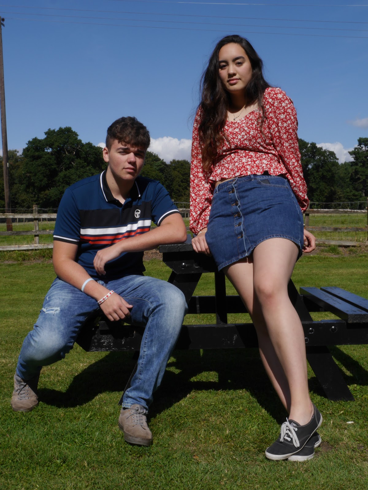
For a unisex fashion and lifestyle magazine, I wanted some two shot cover photos with both a male and female. I originally did a photoshoot with two people both wearing the same outfit to highlight the idea of unisex fashion however, I didn't feel any of them were right to go on the cover. I like this image as it is low angle and has different levels in it. Something I've noticed since uploading and sorting through the photos is Kim has her phone in her pocket and Leyton has charity wrist bands on, there is also a telegraph pole in the background. Despite there being a few unwanted items I still really like this photo and think it has potential to be a good cover.
Subscribe to:
Comments (Atom)